A brand color picker for Storyblok, with a contrast check built in
Editors pick from the brand palette, and see right away whether text on that color stays readable
TL;DR A Storyblok field that limits colors to your brand palette and shows a live WCAG contrast check. Copy the prompt and build it yourself.
A free hex input is how a landing page ends up in "almost our teal". This field gives editors the brand palette as swatches and tells them, while they choose, whether white or dark text on that color is readable.
What it's for
Brand colors live in a design system, but in a CMS they often turn into a text field where anyone can type anything, and you get section backgrounds that are slightly off, or white text on a yellow banner that nobody can read. This field keeps editors on the palette, and if your team allows custom colors, it still shows the contrast result before anything goes live. Accessibility becomes part of picking a color, not a review step afterwards. (WCAG is the accessibility standard for readable text.)
What you get
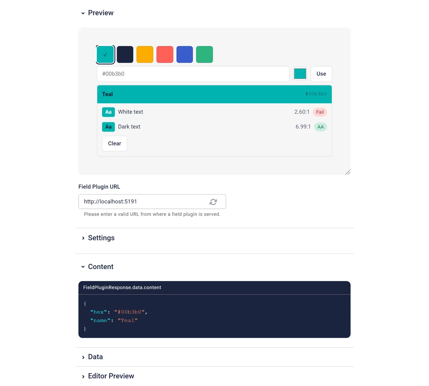
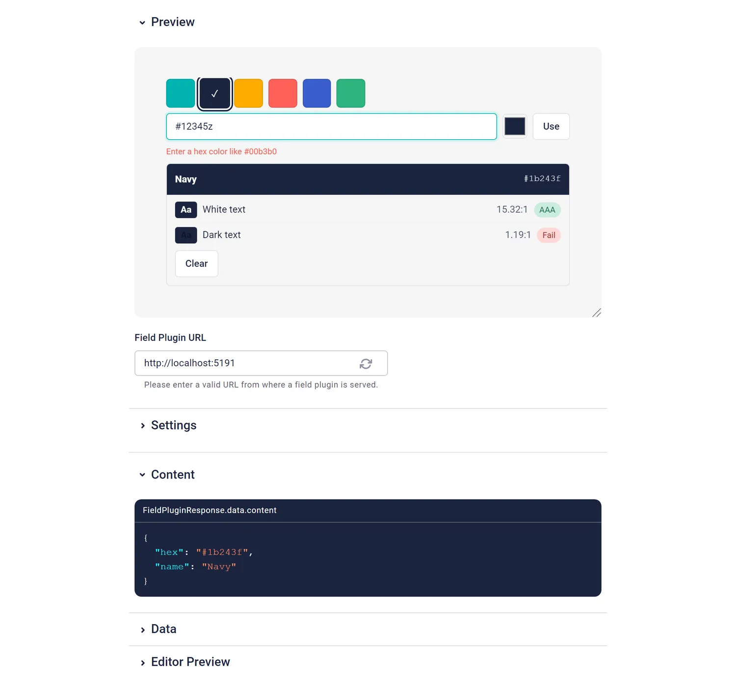
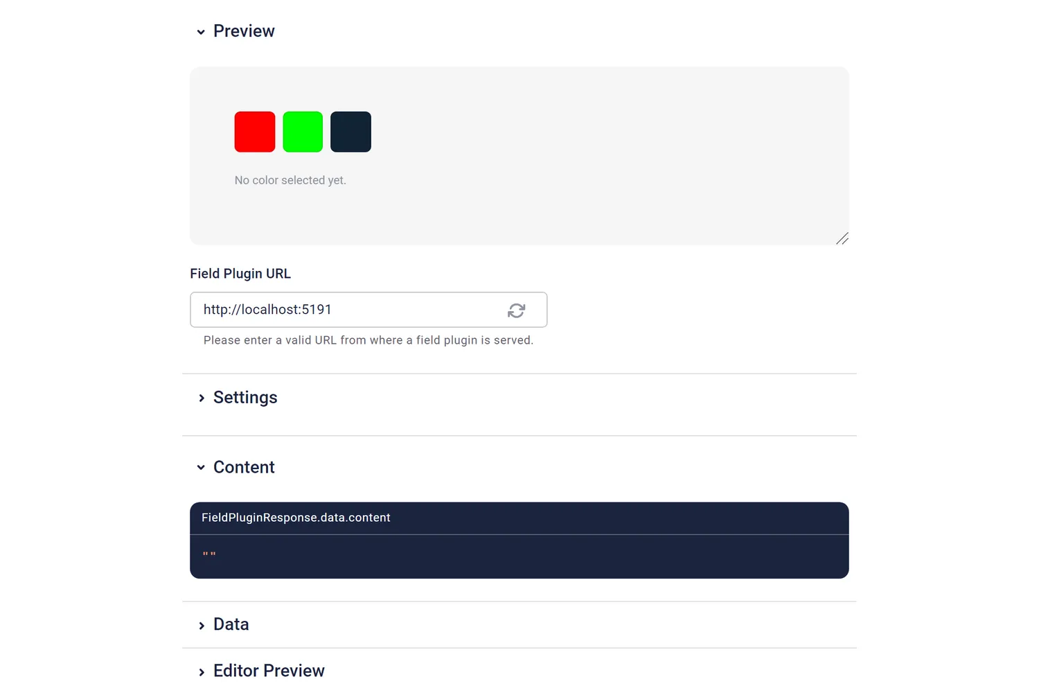
The stored value:
{ "hex": "#00b3b0", "name": "Teal" }| Option | Default | What it does |
|---|---|---|
palette | Teal:#00b3b0,Navy:#1b243f,… | Comma-separated Name:#hex entries. The name is optional. |
allowCustom | false (sandbox: true) | true lets editors enter any hex color. |
Using it in the frontend
<section style={{ background: blok.color?.hex ?? 'transparent' }}>…</section>What I learned building it
- This was my reference field. I built it in my main Claude session, before handing any field to fresh agents, to see whether Storyblok's docs, the field plugin CLI, the starter template and a prompt were enough. They were: about 270 lines of field code and 6 tests, green on the first try. It then became the example for how options get parsed and old values get read.
- Good to know: options are always strings.
allowCustomarrives as"true", nottrue, and a value set infield-plugin.config.jsonis only the sandbox default. For a real component, the value is set per field in the component schema. That's why the code default isfalsewhile the sandbox saystrue. - The browser tests found a gap in the docs, not in the code. An unnamed palette entry stores its hex as
name. That's defensible, but a frontend printingnamewould print#00ff00. PLUGIN.md now says so. - The contrast maths held up. The browser walkthrough compared the ratios with an independent WCAG calculation, and also checked 3-digit and uppercase hex, and that a custom color matching the palette gets the palette name.
More background in the article about the original experiment. The other fields: product picker, author picker, recipe picker, code editor.